Return to saved application
Accommodating for an intermittent application experience
Agency technicians were reporting a high number of partially completed, abandoned, and duplicate applications in their case management tracker. They were spending time and resources manually closing out applications or recontacting the applicant. Our team set out to understand the issue.
Through multiple rounds of usability testing, we were able to identify a glaringly obvious design problem with a simple solution that eliminated frustration on both the public and agency side.
tl;dr
My role
Interaction design, usability research
Why aren’t users completing their applications? Is the application too long? Do users understand their deadline? Are they restarting their applications from scratch? Could it be something else entirely? Before we can think of solutions, my team had to test the as-is process of filling out an application and understand the obstacles to completing and submitting it.
Let’s test it
Usability findings
Usability testing of the as-is process revealed several challenges to completing an application that require policy changes and technical enhancements that are now part of an agency roadmap to ease the burden on the public. However, we observed a significant problem with an easy solution that the agency could implement right away: users simply couldn’t find where to resume their application.
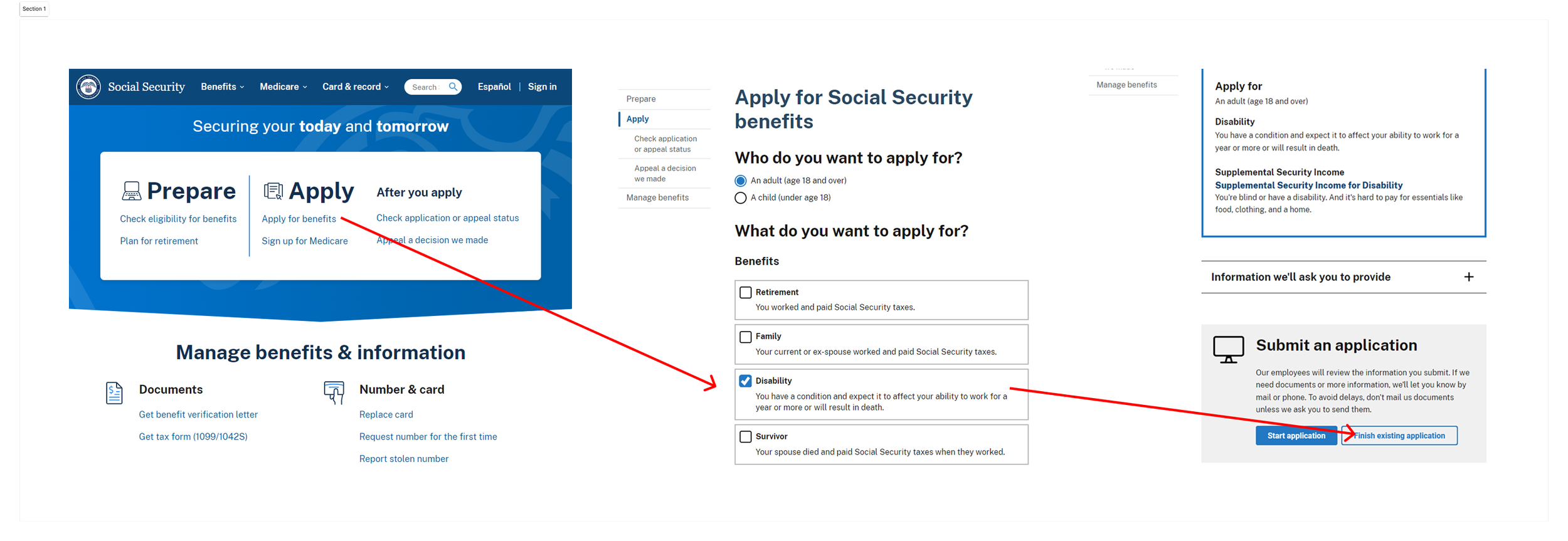
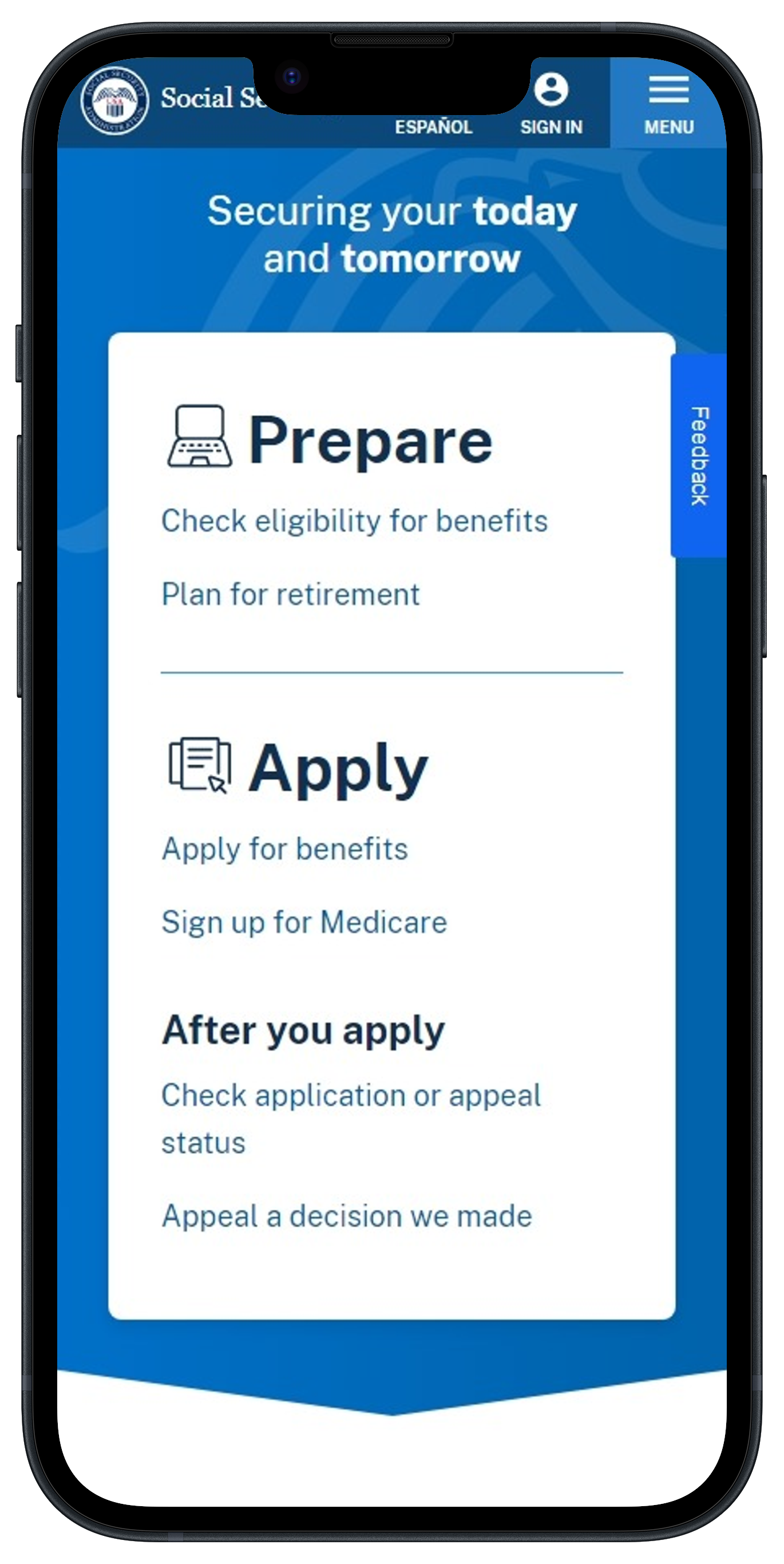
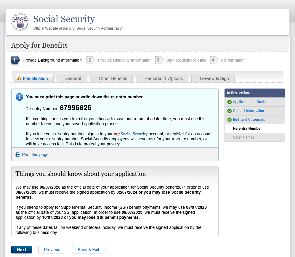
If a user saved their application and attempted to resume at a later time from the agency home screen, there was no clear path to pick up where they left off. They would have to click “Apply for benefits,” reselect the benefit for which they were applying, then would see a secondary button allowing them to “Finish existing application.” Before they would get to that point, our usability participants assumed there was no way to restart. Frustration would boil over to the point they would abandon their online application and call the 1-800 number, or restart an application altogether.
Design solution
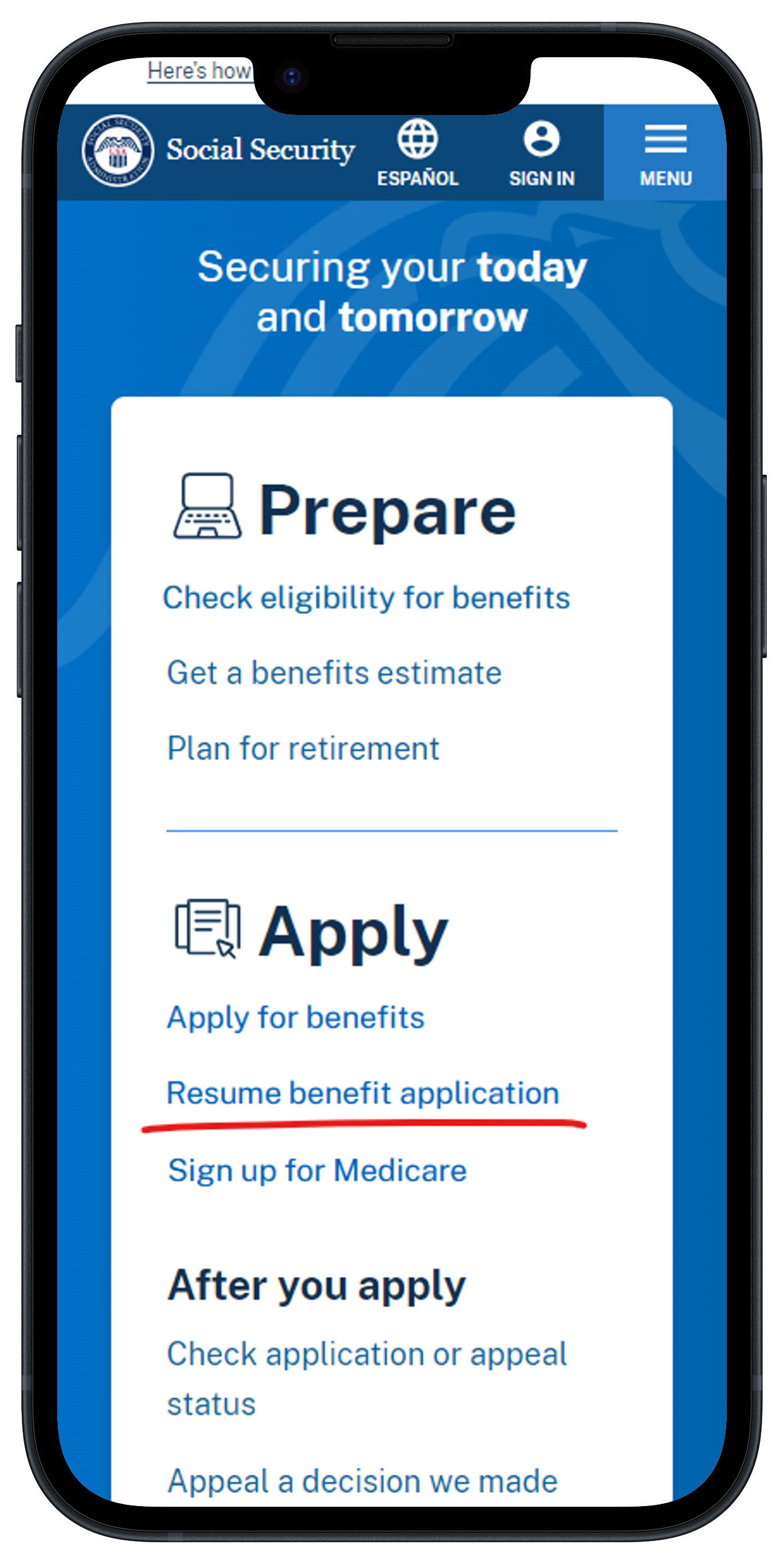
To remedy this problem, the solution was as simple as it gets: just put a link on the home screen that clearly states they can resume an application they already started.
In our initial testing, only 12% of participants could resume an application they had saved and attempted to reopen. After adding a link to the homepage that read “Resume benefit application,” we observed a 100% success rate in resuming a started application in a following usability session.
This evaluation illustrated to me that not all challenges require complex solutions to get real results. Small changes can pay big dividends, you just have to be curious enough to look at processes at their most basic level.